Strava
Active member
- Joined
- Feb 14, 2021
- Messages
- 120
- Reaction score
- 53
- Points
- 28
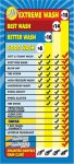
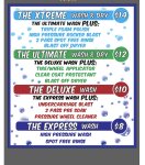
I'll be increasing my prices soon, and I want to redesign my old D&S menu. I've been doing a lot of googling and looking at other people's menus and I came across the one in the picture below. I noticed that 99% of the iba menus I've seen out there either provide a bullet points list of each item that's in the package or they have colorful icons. I really like that in the picture below that it only says good, better, or best, with no breakdown of what comes with each selection. We all know people don't read signs and I'm looking to declutter as much as I can. Why don't more operators use a minimalist menu design? I asked Robert Greene the operator of that site and he said they are going to transition their other locations that that design. Before I get my new menu & advertising printed up I wanted to see if there are any drawbacks to going this route.
Attachments
-
 64.3 KB Views: 71
 -
 109.3 KB Views: 70